Heliodon
How can architects prototype in VR like a UX designer?
A Unity based XR prototype, where users gave feedback on how a renovation would impact sunlight in a work space and their experience through out the day.
Year: 2024
Role: Spatial Designer and Prototyper
Tools: Unity, Blender and Figma
What was the problem?
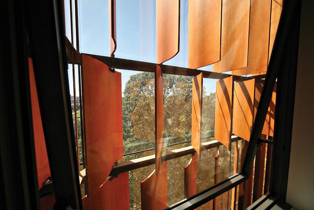
The University of Sydney's New Law Building was going to reposition the louvres (wooden slats) in a planned, upcoming renovation after receiving complaints from staff and students about excess sunlight disrupting their day.
The traditional methods previously employed had not foreseen how the sunlight would interact with the user experience of the faculty with the building.
The Challenge
To solve the problem of non-architects not knowing how to communicate their needs and desires to architects, I was commissioned by Dr. Anastasia Globa to create a virtual reality experience that facilitated this communication. Because most users would be experiencing VR for the first time we needed to design a user experience that was both immersive and intuitive to learn. I was given a 6 week timeframe with a testable prototype due on the 4th week.
Unity Prototype
First, I targeted the core features that underpinned the whole project going forward.
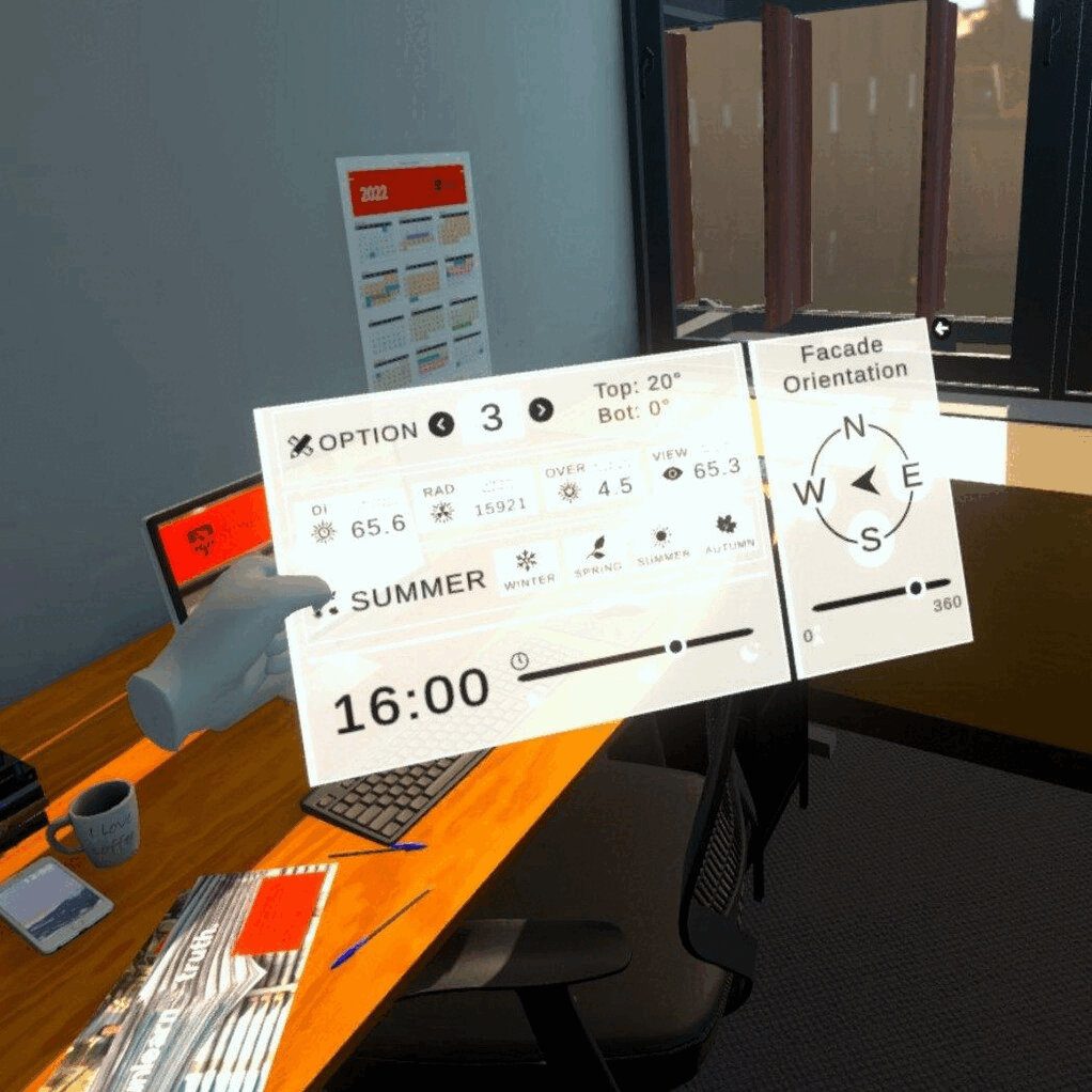
Unity
I produced a VR scene that allowed users to set the Sun's angle accurately to the time of day and year specifically for Sydney
I scripted the UI's functionality which was responsive to the user's input.
I implemented the Post Porcessing, audio and improved the lighting to make the experience engaging and accurate.
Blender
I culled 50% of the veracities from the scene provided to my by Dr. Globa without sacrificing the complexity or quality of the assets.
Figma
I optimised the UI for the scene including a night and day mode.

User Testing
Then, we did a round of user testing with 5 students from the University of Sydney who had little experience in VR.
What are we testing?
Core to the experience is if the product had the ability to facilitate a meaningful conversation between users and architects.
What did we learn?
When I talked to the users after the experience, I found that had been immersed and were able to make qualitative assessments about the proposed renovation.
However, I observed that the UI was overly complicated and contained too much information at once. It took a long time to on-board users and when asked questions they felt overwhelmed and were slow to answer.

Changes incorporated
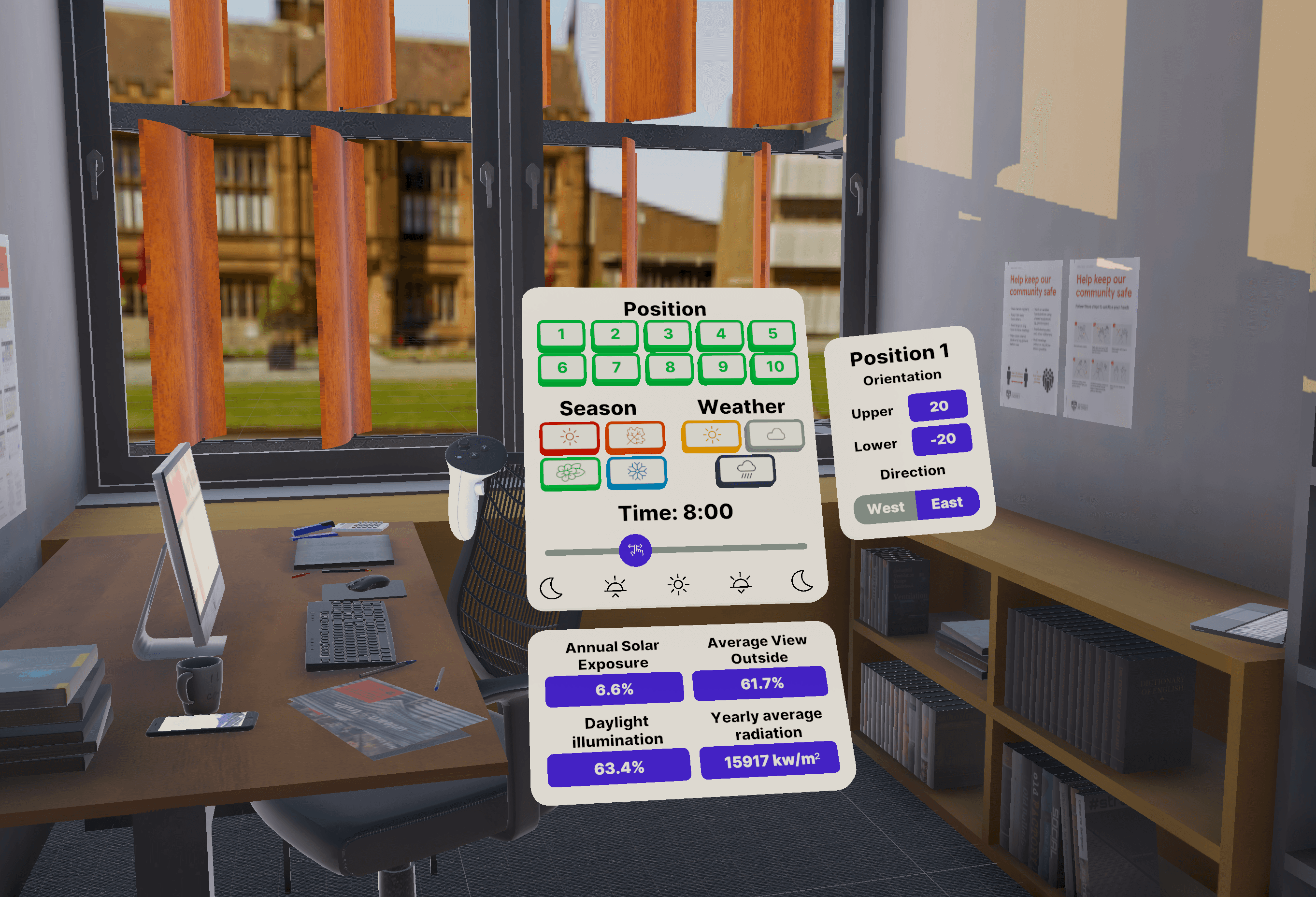
Therefore, the target was to iterate on the UI to make it more easy to interact with.
Changes to layout
Buttons are clearly labelled and colour coded for easier identification.
In-depth information moved to the right and bottom of the panel to reduce the visual clutter and group necessary information when needed.
Changes to interactions
The ray caster has been removed and instead replaced with a hand and controller paradigm.
The controller is to ground the user as to where the panel is as some users forgot which hand had the panel when it was a double controller experience.
Hand interaction is used because it allows more natural input that builds on existing physical design patterns the user understands.